Brand assets
Kata brand assets.
The identity, ready to use. Eight dots, one heart, seven area colors, one typeface. Take the pack, or single files below.
The mark
Eight dots, one heart.
Health is never one thing. Training, food, water, sleep, recovery, the mind, the numbers and the coach reading them. Every part is real on its own. Not one of them works alone.
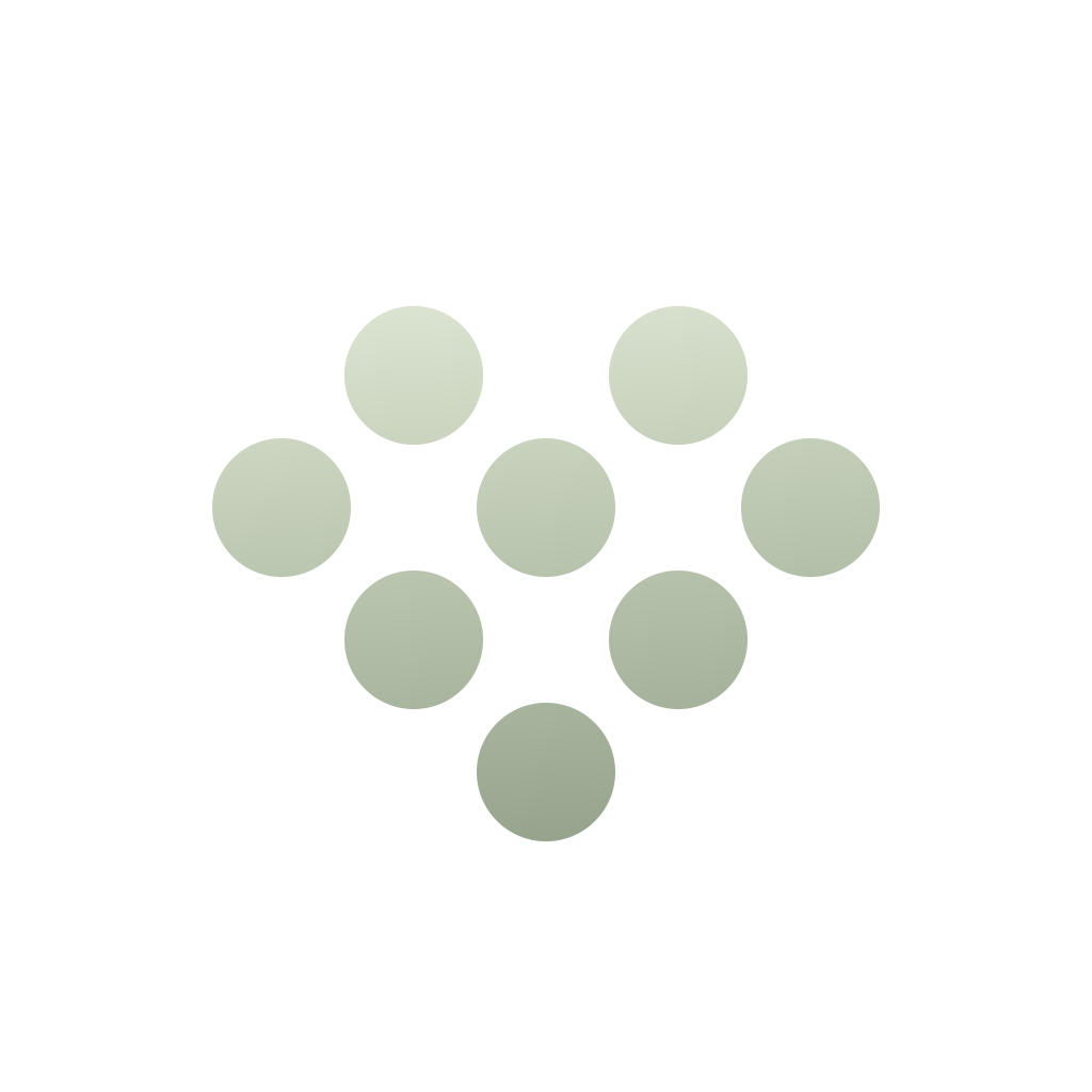
So the mark is not one shape. It is eight dots, set in relation to each other, and the heart is what they make together. The parts of a person, held in one system.
Kata is the Japanese word for a form you practice until it stops being effort and becomes you. Many repetitions, one shape. The dots are those repetitions: the day you logged, the set you finished, the night you slept. Each one is small. Together they are the practice, and the practice becomes the person.
The living gradient
One mark. Every color.
Color is not decoration here. It tells you where you are. Every area of Kata owns one gradient, and the mark takes the color of the area you are standing in.
Left alone, the mark walks the whole system: 36 seconds, one color into the next, the lighter end always at the top because light falls from above. The lockup, the symbol and the primary button read the same clock, so the identity is never out of phase with itself.
What each color means.
Movement, sessions, what you build. Green: growth, trained one session at a time.
What you are working on, plus water and data. Clear, measured, factual.
Night. Rest owns a color of its own.
Plum and berry. What feeds the body, supplements included.
The day in front of you. Sunrise, energy and the first hour.
How you are. Cool water, apart from the rest.
The coach speaks from here. Ink, never decoration.
Logo
The lockup.
The eight-dot heart and the wordmark, locked together. Give it one heart height of clear space on every side. Never redraw, recolor or stretch it.
Symbol
The heart.
Eight dots make a heart. It stands for Kata on its own: app icons, avatars, favicons, anywhere the wordmark will not fit. The dots are solid, never outlined.
Color
The color system.
Two brand gradients and six area pairs. Each area of the app owns one, so you always know where you are by the light around you.
The two brand gradients.
The brand gradient. It carries the mark, the washes and every brand surface.
Ink, dark surfaces and primary buttons. Type derives from #2d3233, never pure black.
One rule holds everywhere: the strong end sits at the bottom, and the light end is fully there at 72 percent, holding to the top. Light falls from above. Buttons follow it too: the same pair, the same fall, a white label.
The area pairs.
The sage the whole system rests on.
Movement and growth. Green, trained one session at a time.
What you are working on, plus hydration and data. Steel blue, clear and measured.
Night. Violet owns rest.
Plum and berry. What feeds the body, supplements included.
The day in front of you. Apricot: sunrise, energy and the first hour.
Aqua. Cool water, apart from the rest.
Mineral Black. The coach speaks from here.
Terracotta. Reserved for what removes. Never decoration.
Buttons, the pair itself.
The one thing on a screen you are meant to press. A filled button carries its area pair itself: the strong end at the foot, the light end fully reached at 72 percent, and the label is white, never black. The number on the right is white against the midpoint of that fall, where a label actually sits. Stated honestly: only Mineral Black clears 4.5, which is why the default button everywhere is the black pair. A page that owns a color runs its own pair and accepts the softer number.
Tags and selection, paler still.
A pretitle tag is not a button, and neither is a segmented control or a language pill. Anything that reports state takes a pale wash of its family light end and writes on it in the family’s own ink. The number on the right is that ink on that wash. Only the thing you press is saturated.
Neutrals.
Type
Articulat CF.
One family, three roles. Nothing else.
ABCDEFGHIJKLMNOPQRSTUVWXYZ
abcdefghijklmnopqrstuvwxyz 0123456789
Tell Kata about your day.
Titles. Set tight: -0.032em at hero size, easing to -0.012em at 18px.
ABCDEFGHIJKLMNOPQRSTUVWXYZ
abcdefghijklmnopqrstuvwxyz 0123456789
Tell Kata about your day.
Body and interface.
ABCDEFGHIJKLMNOPQRSTUVWXYZ
abcdefghijklmnopqrstuvwxyz 0123456789
Tell Kata about your day.
Emphasis, figures and button labels.
Usage
How to use it.
Light from above
The lighter end of a gradient sits at the top or the side. Buttons keep it: two flat stops, lighter head, deeper foot, and no sheen anywhere.
Mineral Black, not black
Ink is #2d3233. Pure black appears only inside the dark surface ramp.
Button physics
Primary is a Mineral Black pill with a white label. Secondary is a light grey pill with a grey label. Both full pill radius.
Clear space
One heart height around the lockup. The lockup never goes below 88px on screen or 22mm in print.
Do not.
- Write KATA. The brand is Kata.
- Recolor, outline or add effects to the mark.
- Stretch, rotate or crop the lockup.
- Flip a gradient so the deep end sits on top.
- Set titles in anything but Articulat CF Medium.
- Use the mark to imply endorsement or partnership.
Take the whole kit.
The pack holds every logo, symbol and wordmark variant as SVG and PNG, the nine gradients, a colors sheet and a readme.
Download the full pack